myOneFlow
In a hurry?
Feel free to skip ahead—though you might miss a great story!
Hope you find what you need!


Four problems. Four interventions.
One shift in how the platform works.
This wasn't a UI polish job. Each design decision was a direct response to an operational failure. Here's what we changed and why.
PROBLEM 1
Waiting on a human for every move.
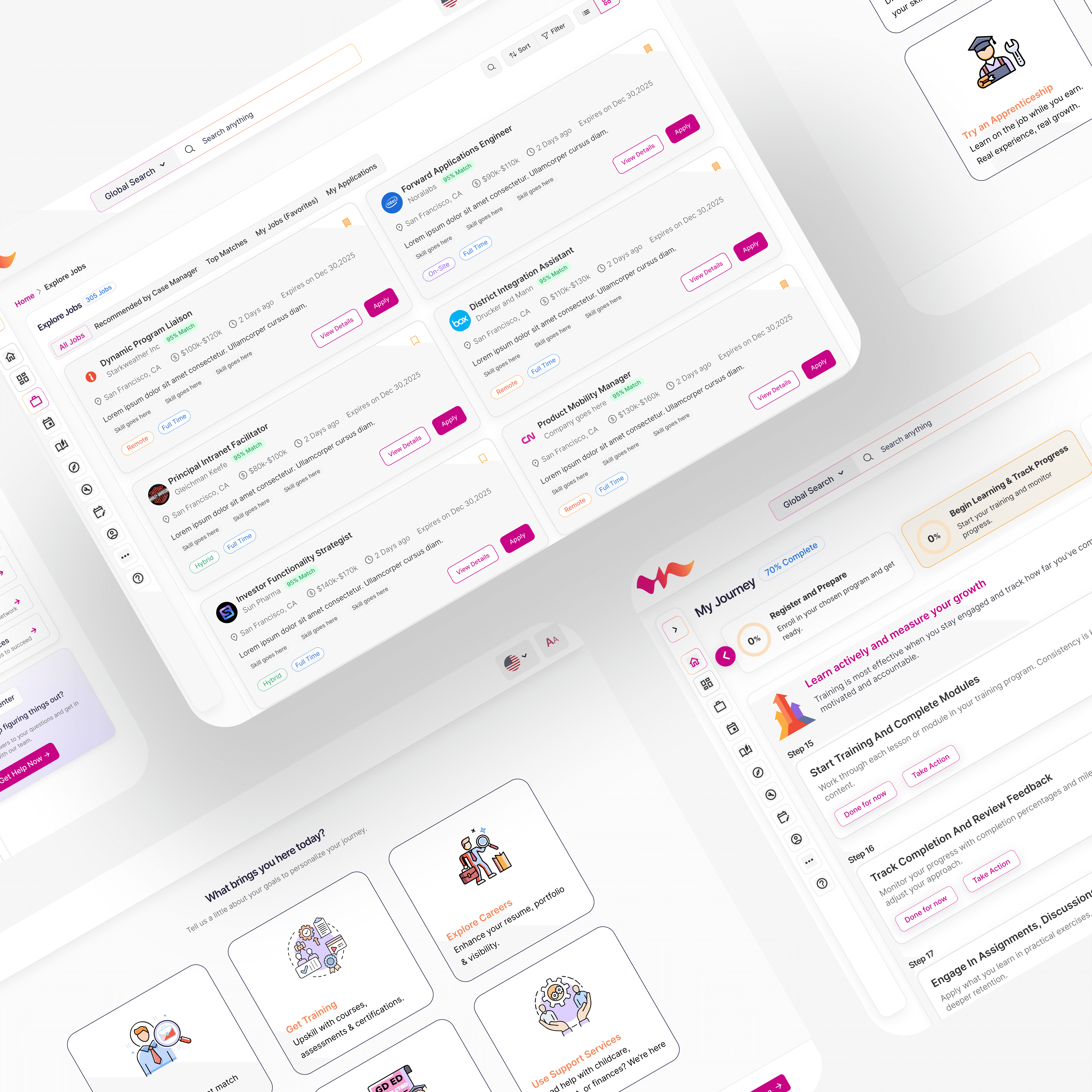
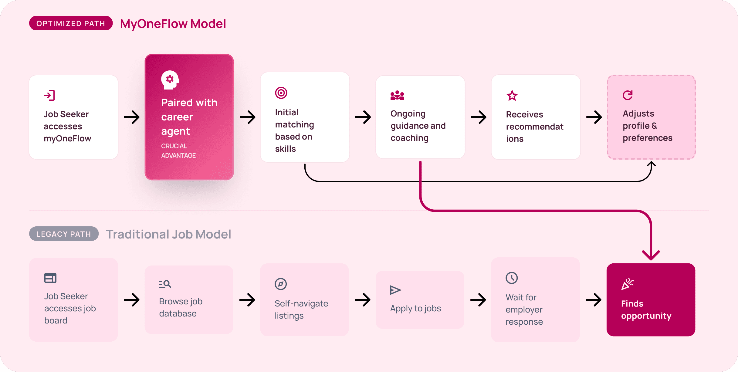
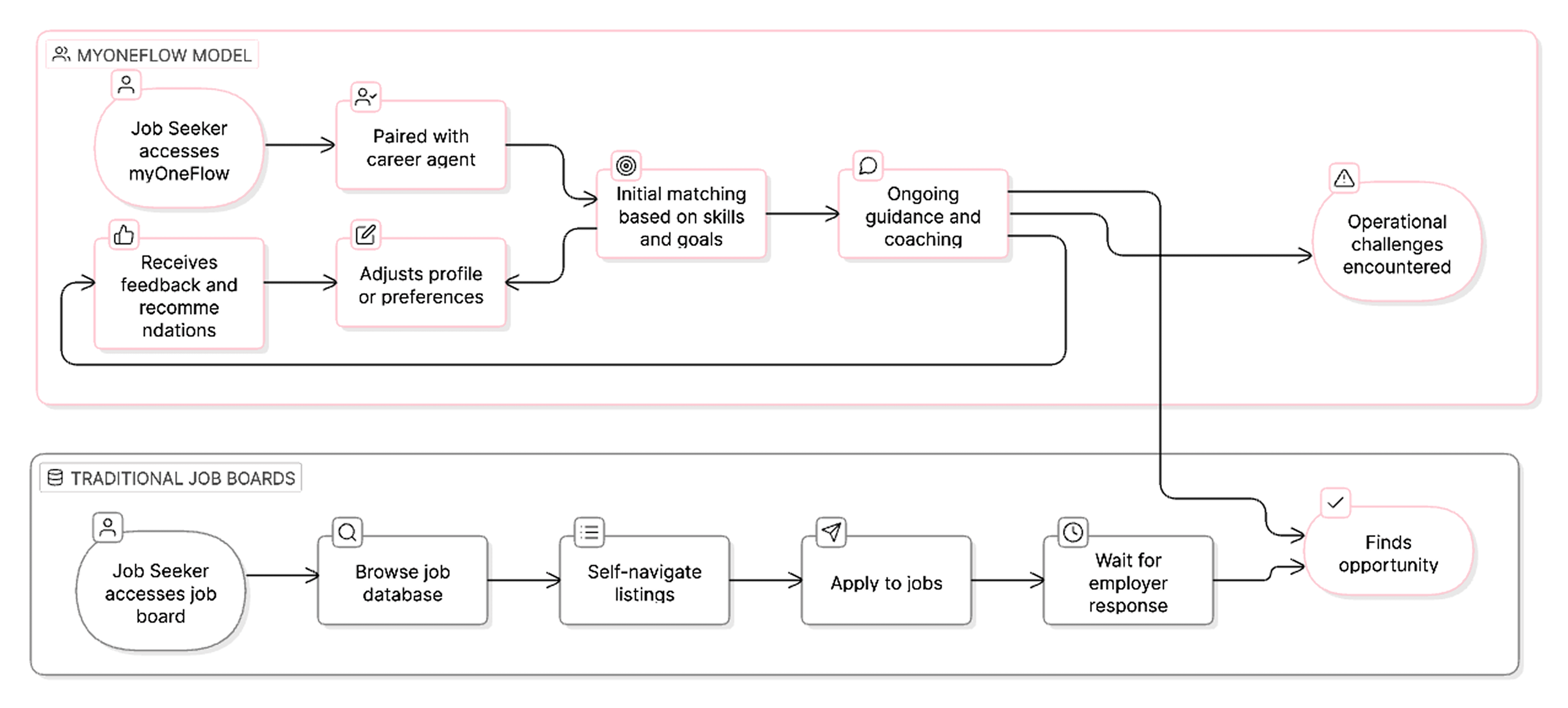
Job seekers had no agency. No profile. No preferences on file. The system didn't know anything about them until a case manager told it.

DESIGN DECISION 1
Onboarding that sets you free
What used to be a 30-minute call is now a 5-minute self-serve flow. The system learns her goals upfront and personalises from day one.
For the first time, Rosa doesn't need anyone's help to get started.
PROBLEM 2
One client at a time, all day long
Case managers were processing approvals and updates individually. A task that should take 5 minutes per client was taking an hour spread across 60.
DESIGN DECISION 2
Bulk actions for case managers
Bulk selection across clients — approve, update, flag a cohort in one action
Grouped workflows replaced one-by-one task processing
What took Maria a morning now takes 10 minutes.
PROBLEM 3
Human intuition doing machine work
Every job recommendation was a manual decision. No consistency, no speed, no ability to match at scale.
DESIGN DECISION 3
Hybrid matching — human + system
This was only possible because of Decision 1.
Onboarding gave us the data. Now the system generates match scores automatically.
Maria reviews. She no longer recommends from scratch.
From guessing to verifying.
PROBLEM 4
Employers were losing confidence
Open roles stayed unfilled for too long. Employers stopped trusting the platform to deliver candidates. Churn was growing quietly.
DESIGN DECISION 4
Employers finally see the right candidates — not just any candidates.
Because job seekers completed onboarding, employers now get ranked matches with match % scores.
Case managers pre-shortlist the most suitable applicants before employers even log in.
THE REAL INSIGHT
This wasn't a design problem. It was a systems problem.
The interface was a symptom. The real issue was that the entire operating model placed one person — the case manager — at the center of every decision, every user, every step.
Too much control created bottlenecks. Too little guidance removed value. The solution wasn't choosing one or the other — it was designing a model where autonomy and support could coexist. Rosa gets to explore on her own terms. Maria still has her back. The system handles the rest.
The biggest shift I made wasn't in the UI.
It was convincing stakeholders that the product needed a new operational philosophy before it needed new screens.
Key Takeaways: Learning and Growing Through Challenges
Design the system, not just the screen
The real work happened before any wireframe — the operating model was broken, not the UI.
Constraints sharpen decisions
Compliance, a tech migration, four stakeholders — every constraint forced a better, more defensible design choice.
Autonomy and support aren't opposites
Rosa needed freedom. Maria needed capacity. The answer wasn't choosing one — it was designing so both could win.