INDIAai

India's AI platform for 1.4 billion people.
Nobody could find anything.

A platform drowning in its own ambition- too much content, no hierarchy, no community voice. Design team was brought in to make sense of it.

Industry


IT


IT

Role

UX Researcher & Designer

Product Strategy + Design

Platform

Web · Government

Web · Government

Team

Product Manager, Owner and Developers

Product Manager, Owner and Developers

In a hurry?

Feel free to skip ahead, though you might miss a great story!

Hope you find what you need!

proof the audience was there, proof the design had to earn their attention

191,0000
20

average visit duration- users who stayed, stayed long enough to matter

mins

homepage iterations shipped in response to real stakeholder and user feedback

40

+

Why this platform existed

India's government saw it coming.

In collaboration with NASSCOM, they built INDIAai - a centralised platform for everything happening in India's AI ecosystem.


Research reports. News. Startup opportunities. Policy updates. Community contributions.


The ambition was exactly right. A single place where a CS student in Pune and a policy researcher in Delhi could both find what they needed.

The platform existed. The audience came. But the design couldn't keep up with its own ambition.

The platform served everyone from 19-year-old CS students to 55-year-old policy researchers. Designing for that range, under government constraints, with no single user type to anchor decisions, that was the real design challenge.

The platform served everyone from 19-year-old CS students to 55-year-old policy researchers. Designing for that range, under government constraints, with no single user type to anchor decisions, that was the real design challenge.

WHAT WE FOUND

Every new initiative got added.
Nothing got prioritised.

The platform kept growing and kept getting harder to navigate. Three structural gaps were quietly breaking the experience.

Content without hierarchy

New initiatives, research, and news kept being added with no sense of what mattered most. Valuable content was getting buried the moment it was published.

Navigation that didn't reflect reality

Critical sections weren't in the navigation. Things that deserved prominence were hidden. Users couldn't build a mental model of what the platform contained.

A community that didn't know it existed

User generated content was possible but invisible. Contributors didn't know they could publish. Readers didn't know real people were writing here too.

My job wasn't to redesign screens. It was to redesign how the platform communicated what it was and who it was for.

WHAT MADE THIS HARD

This wasn't a startup.
Every decision survived a stakeholder round.

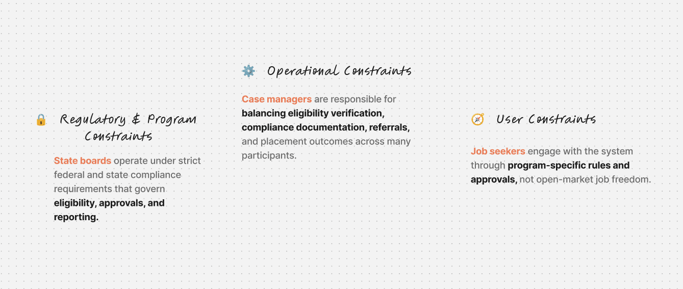
Now MEET MARIA. Rosa's case manager. And 99 other people's too.

Every design decision we made had Maria in mind and a government budget behind her.

Avg. clients per case manager

100+
Plus support calls

Average salary for one case manager

~$53,000/year

Case managers currently on platform

500+ case managers across 12 states

0
1
2
3
4
5
6
7
8
9
0
1
2
3
4
5
6
7
8
9
0
1
2
3
4
5
6
7
8
9
0
1
2
3
4
5
6
7
8
9
0
1
2
3
4
5
6
7
8
9
0
1
2
3
4
5
6
7
8
9
0
1
2
3
4
5
6
7
8
9
0
1
2
3
4
5
6
7
8
9
0
1
2
3
4
5
6
7
8
9
+

Fewer inbound support calls from job seekers asking what to do next

400

%

300

%

Reduction in operational staffing costs for case manager teams

3x

Growth in job seekers a single case manager can support simultaneously

Increase in self-served job applications without case manager involvement

250

%

WHAT CHANGES

From dependency to guided autonomy — These are the numbers we're targeting.

From dependency to guided autonomy

Want to know the trade-offs?

Every constraint, every stakeholder conflict, every decision that didn't make it into the final design — I'm happy to walk through all of it. Reach out.

The reality behind the workflows

Who is this really for?

To understand what was breaking, we first needed to understand who was using the system and under what conditions.

Before redesigning anything, we needed to understand who was actually using this and what their day looked like.

Clients: Job Seekers & Students
The heart of the system

Looking for jobs, training programs, and career support.

Case Managers

Hands-on guides who enable client success

Guiding clients, recommending opportunities & tracking progress.

Admins

System architects

Configuring workflows, managing permissions & ensuring compliance.

Employers

The Opportunity Providers

Posting jobs, reviewing applications, and connecting with candidates.

Clients: Job Seekers & Students
The heart of the system

Looking for jobs, training programs, and career support.

Case Managers

Hands-on guides who enable client success

Guiding clients, recommending opportunities & tracking progress.

Admins

System architects

Configuring workflows, managing permissions & ensuring compliance.

Employers

The Opportunity Providers

Posting jobs, reviewing applications, and connecting with candidates.

THE PLATFORM'S BIG IDEA

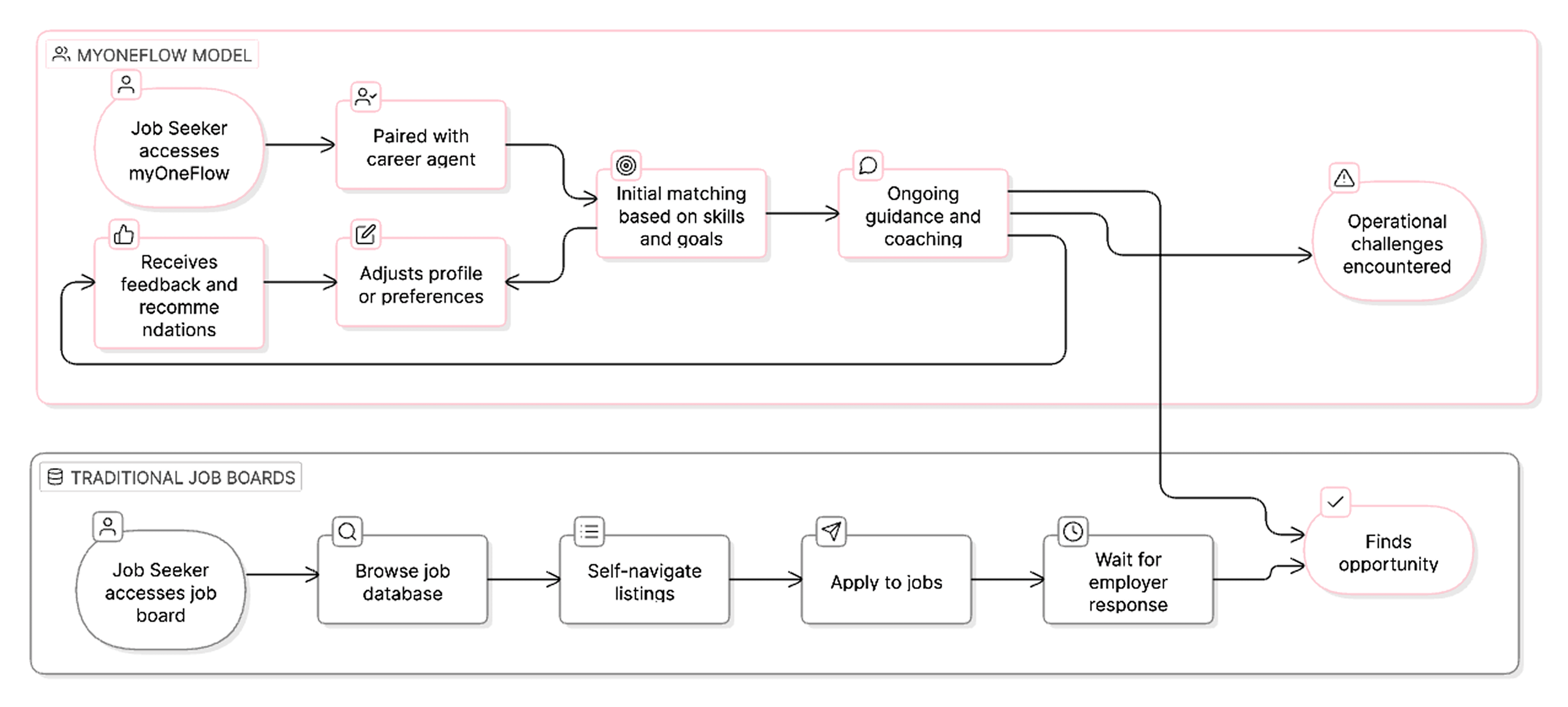
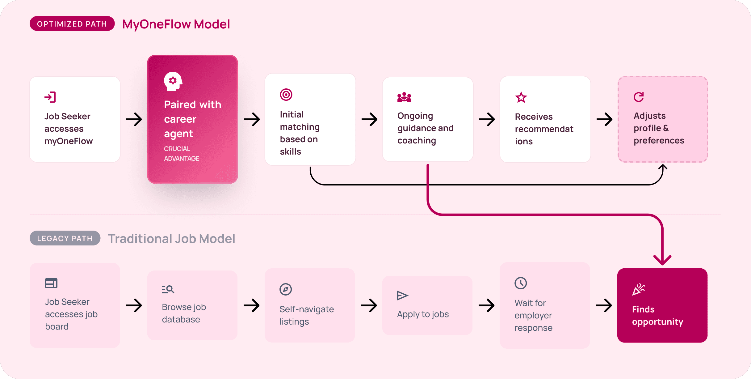
Think of it like having a career agent — not just a job board.


LinkedIn and Indeed hand you a database and leave the rest to you.

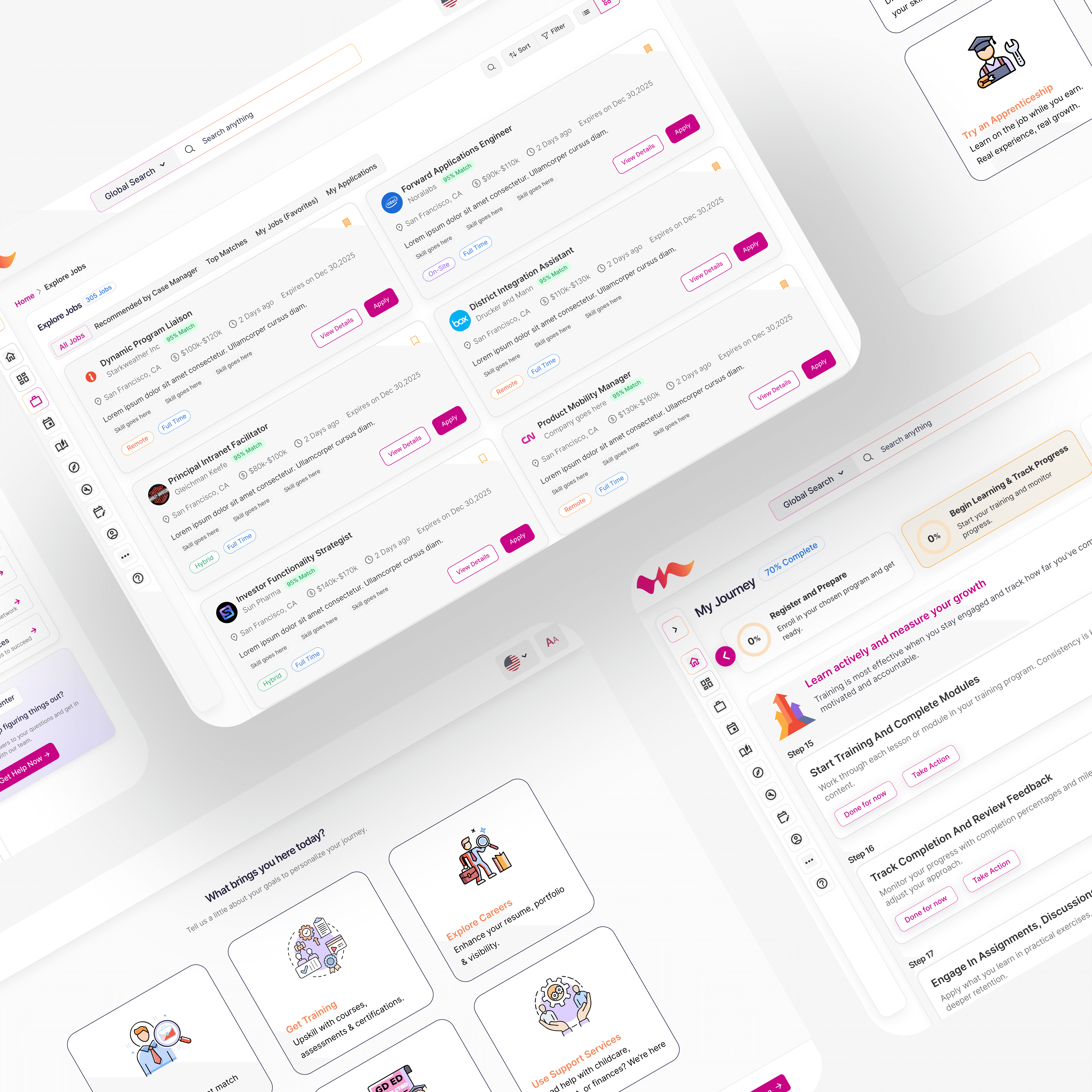
myOneFlow is different. It pairs job seekers with case managers who act like career agents, guiding them toward opportunities that match their skills, training history, and long-term goals.


Much like how actors rely on agents to connect them with auditions and roles, case managers guide job seekers toward opportunities that match their skills, training programs, and long-term career goals.

The business logic is brilliant. The operational reality? It is quietly breaking.

Three gaps. Three interventions.
One platform that finally made sense.

This wasn't a visual refresh. Each decision was a direct response to a structural failure and had to survive stakeholder review to ship.

PROBLEM 1

Content with no order

Everything kept getting added. Nothing communicated what was most important.
The platform had no spine.

DESIGN DECISION 1

Restructured navigation and hierarchy

  • Audited everything on the platform and rebuilt the navigation around what users actually needed, not what had accumulated over time.

  • Content that was buried got surfaced.

Why? Users couldn't form a mental model of the platform because the navigation reflected what had been added over time, not what they needed to find. Restructuring around user tasks, not internal teams, was the only fix that scaled.

PROBLEM 2

A homepage for everyone, optimized for no one

Entry point for a CS student, a researcher, a journalist, and a government official- all at once. It was trying to do everything and succeeding at nothing.

DESIGN DECISION 2

Iterative homepage revamps

  • Redesigned the homepage four-plus times, responding to stakeholder feedback and real user behaviour each round.

  • Each version got closer to communicating the platform's full value in the first scroll.

Why? The homepage wasn't failing because of bad design, it was failing because it had no point of view on who to serve first. Each iteration forced a sharper answer to that question.

Why? The homepage wasn't failing because of bad design, it was failing because it had no point of view on who to serve first. Each iteration forced a sharper answer to that question.

PROBLEM 3

Community hidden in plain sight

The feature existed. Nobody knew. Contributors weren't publishing. Readers didn't know they could. The platform felt like a notice board, not a community.

DESIGN DECISION 3

User generated content as a first-class feature

  • Redesigned how UGC was surfaced: prominent placement, visible contributor profiles, clear pathways to publish.

  • The platform stopped feeling like a government notice board and started feeling like a community.

Why? A community feature is only as strong as its visibility. If people don't see others contributing, they don't feel invited to contribute themselves. The design had to make the community feel alive before it actually was.

THE REAL INSIGHT

This wasn't a visual design problem.
It was an information problem.

The platform had everything users needed. The design just wasn't letting them find it or contribute to it.

A government platform doesn't get to be experimental. It has to be clear. Every stakeholder constraint pushed us toward simpler, more obvious solutions and that turned out to be exactly what the users needed too.

The biggest shift wasn't in the screens. It was convincing stakeholders that clarity and credibility aren't opposites, that making the platform easier to navigate would make India's AI story land harder, not softer.

THE REAL INSIGHT

What this project taught me that no other project did.

Constraints are a design tool

Working under government oversight forced every decision to be defensible, not just desirable. That pressure made the work more rigorous, not less creative.

Hierarchy is strategy


Deciding what goes where isn't a visual decision, it's a product strategy decision. On INDIAai, information architecture was the most important design work on the project.

Community doesn't build itself

UGC doesn't happen because the feature exists. It happens when the design makes people feel like their contribution belongs there. Visibility is the activation mechanism.
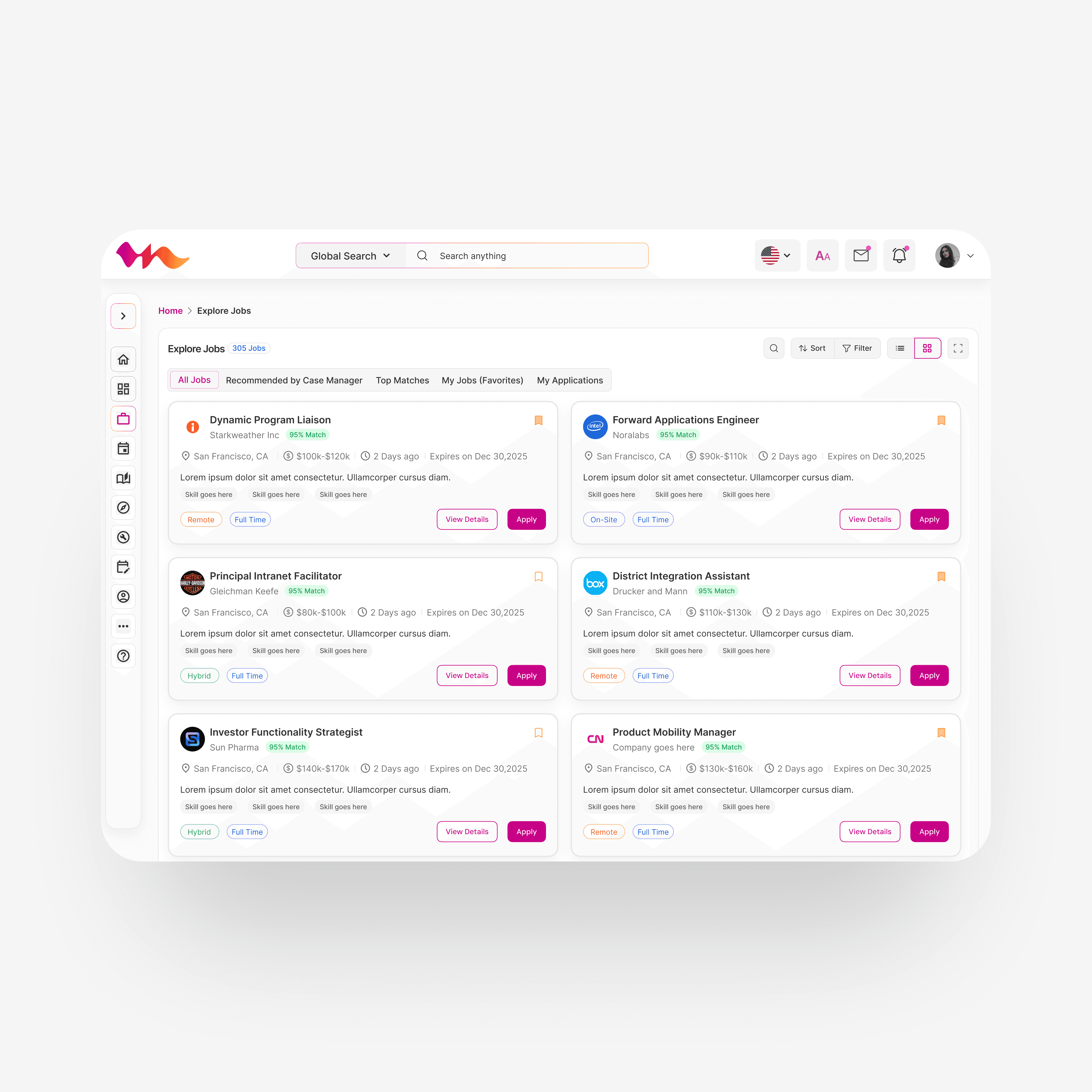
WHAT WE FOUND

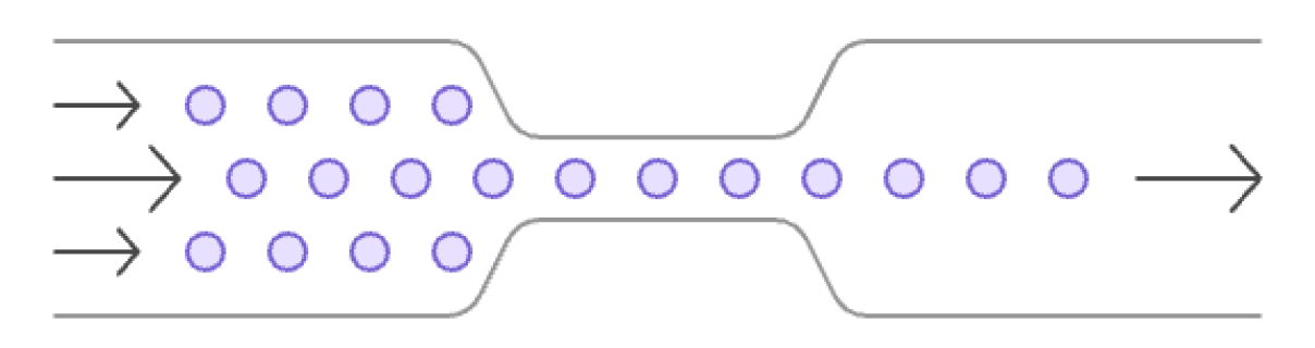
The "agents" became the entire system.
And the system couldn't scale.

After auditing workflows and interviewing stakeholders across job seekers, case managers, and employers, we identified four structural cracks in the foundation.

Client Management

Case Manager

One person. Every decision. No way to scale.

Job Matching & Applications

Communication & Coordination

Jobs unfilled

Employers waiting.

Job seekers stuck.

My responsibility as the product designer was to ensure the product experience could support this necessary shift in operational strategy.

To accomplish this, we introduced 4 key design interventions, each directly addressing one of the operational flaws.

My responsibility as the product designer was to ensure the product experience could support this necessary shift in operational strategy.

My responsibility as the product designer was to ensure the product experience could support this necessary shift in operational strategy.

Flaw 01

Job seekers couldn't self-serve

  • Every action — from browsing jobs to applying — required case manager involvement. Rosa couldn't do anything without waiting for Maria.

Flaw 01

Job seekers couldn't self-serve

  • Every action — from browsing jobs to applying — required case manager involvement. Zero self-serve.

Flaw 02

Case managers were maxed out

  • Approvals, follow-ups, manual recommendations — one case manager handling 60 clients, one task at a time. The ceiling was low.

Flaw 03

Job matching was 100% manual

  • No system intelligence. Every match was a human judgment call, every recommendation a one-off task. Slow and impossible to scale.

Flaw 03

Job matching was 100% manual

  • No system intelligence. Every match was a human judgment call, every recommendation a one-off task. No consistency, no speed, no scale.

Flaw 04

Employers were losing confidence

  • Open roles stayed unfilled for too long. Employers stopped trusting the platform to deliver candidates. Churn was growing quietly.

At some point I stopped asking 'how do we make this easier to use' and started asking 'why does this require so much human effort in the first place.' That question changed everything about how I approached the redesign.

Want to know what didn't survive stakeholder review?

Every constraint, every compromise, every decision that shaped the final product, happy to walk through all of it. Reach out.